
Once, I saw a fellow researcher presenting his work in a 4:3 format at a conference.
“Strange,” I thought, because at the time, my preconception was that the debate over “4:3 vs 16:9 aspect ratio” was already settled, that 16:9 had clearly won.
With that mindset, I started listening to his talk. And as it turned out, his choice of this ‘outdated’ format didn’t matter at all; in fact, it was a strikingly clear and no-nonsense presentation. It seemed like this aspect ratio was a perfect choice for the type of content he was presenting. Later, he even won the best presentation award, against others using the rectangular format.
That moment made me pause and think: Is the square format really dead? Could it have advantages over the rectangular format? And what is the real difference, in terms of impact on the audience, between these two formats in the first place?
Table of Contents
Presentations come in many forms
We consume presentations in so many forms every day; movies, social media posts, the leaflet some stranger hands you on the street, the PowerPoint your coworker shares, or even your doorbell camera. These are all, in a way, presentations.
Even though each presentation has its own unique qualities and differences, they all have one thing in common. They come with a “shape.”
This shape is one of the key elements that determine how the presentation is experienced, regardless of its type.
Take movies, for example, a form of presentation we’re all familiar with. Nowadays, when we go to the cinema, we almost always watch on a rectangular screen; the movie is presented through a rectangular frame.

However, we also occasionally encounter more “squeezed” aspect ratios, such as 4:3 or 1:1.
Why do people choose these different shapes? On what basis?
There are two major influences when it comes to picking an aspect ratio for any kind of presentation: technological and psychological.
Technological aspects: Technology pushed us toward rectangular formats, not square ones
Rectangular screens are everywhere nowadays. From our phone displays and Instagram posts to movies, they dominate almost every kind of presentation. And there’s a clear reason for this.
The biggest factor is technological: rectangular displays are far more efficient to manufacture and use. Electronic displays and sensors are made on rectangular sheets of glass and silicon, known as mother glass or wafers. That means most photos and videos, whether in movies or on your phone, come with a rectangular aspect ratio because the sensors or cameras are rectangular. Other shapes, like circles or squares, would increase material waste and production costs.
So, clearly, rectangular aspect ratios are winning on the technological side. That makes sense. But if we set aside the technological bias for a moment, we start to see that there are also psychological aspects to using different aspect ratios.
Psychological aspects: if we set the technology aside, there are good reasons to use both rectangular and square formats
Even with the technological disadvantages, people still make movies in square formats. That’s because the psychological aspects often outweigh technological convenience.
Oblivious to most of us, movie directors sometimes change the aspect ratio from film to film precisely for these psychological reasons. Both 16:9 (or even wider) and 4:3 are used, even when 4:3 isn’t technically the most efficient choice. Aspect ratio is a tool, a way to convey different feelings and emotions to the audience.
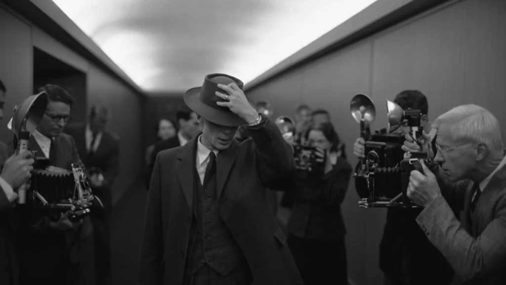
The best example of this is the movie Oppenheimer. Instead of sticking with a single, traditional aspect ratio, Christopher Nolan took a rather radical approach, using two different aspect ratios. In doing so, he leveraged the psychological impact of aspect ratio to its full potential.
The narrow frame (1.43:1 / IMAX) – Subjective experience
A subjective experience means seeing or feeling something from a personal, internal point of view, as if you’re inside someone’s mind rather than just observing from the outside.
In Oppenheimer, Christopher Nolan uses 1.43:1 (IMAX) for key sequences, a nearly square but slightly taller format. Psychologically, this frame draws the viewer in.
The scenes feel more intimate because the character nearly fills the entire frame, leaving little background. The image occupies more of your vertical field of vision, creating intimacy and focus while keeping your attention centered on the character’s experience.

This feeling of being contained goes along with Oppenheimer’s own mental intensity and moral pressure. Every thought, hesitation, and decision feels ‘amplified’ because of the frame; the world feels tight, and that reflects the stakes of building the atomic bomb.
In other words, nearly square aspect ratios like 4:3 (1.33:1) or 1.43:1 used here make the experience, ‘immersive’. We feel like we’re inside Oppenheimer’s head. The vertical space stretches the emotional impact, making every moment hit harder without letting our attention drift. Our mind doesn’t wander; it sticks to one thing, one perspective. We’re ‘boxed in’ with the character, seeing the world exactly as he does.
The Wide Frame (2.20:1) – Objective observation
An objective observation means seeing or describing something from an outside, neutral point of view, without letting personal feelings, biases, or emotions shape what you notice.
It’s about watching what happens rather than experiencing how it feels.
In Oppenheimer, when the film shifts to 2.20:1 widescreen, often during hearings, conferences, or reflective sequences, the frame expands horizontally. That wider frame introduces distance and detachment, giving the audience space to ‘breathe’, to step back and observe the scene rather than being inside the character’s mind.
Because of the widening of the frame, now we get to see the narrative context, the world is judging him, assessing the ethical and societal impact of his choices, creating a sense of structural clarity while keeping us emotionally at a distance.
It signals a shift from subjective experience to objective observation, emphasizing rational analysis over visceral immersion.
In short, as the frame widens, our emotional proximity decreases.
The IMAX sequences put us inside Oppenheimer’s mind, while the widescreen sequences let us step back, reflect, and interpret events from a safe distance.
The psychological aspects of aspect ratio aren’t just for movies, they apply to any type of presentation
Aspect ratio is a versatile tool for portraying this psychological duality in any kind of presentation. It’s not just for movies.
Photographers, for example, use both square and rectangular formats, even when technology might make them less convenient, to convey the right message. Take the photo below: it’s framed so that the viewer’s eye lingers, moving from one part of the image to another. The eye starts to wander, then discovers something else. It’s a careful balancing act between background and subject. In the book, The Photographer’s Eye, Michael Freeman calls this technique the “reveal.”

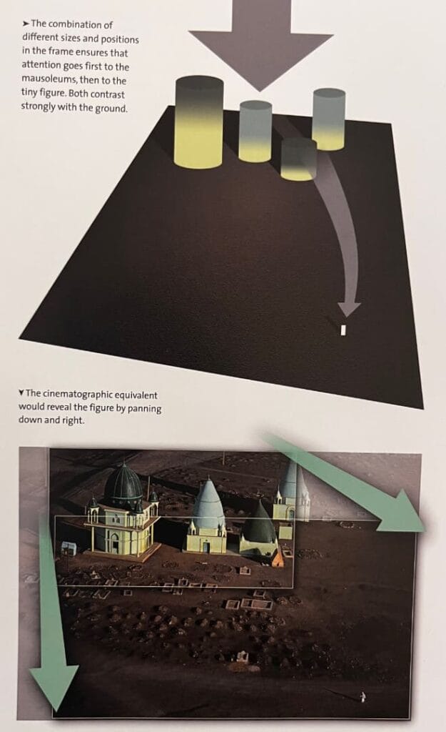
For this type of photograph, a wider aspect ratio like 16:9 is usually the perfect choice, because 4:3 would feel too tight to create that balance between background and subject. But tight aspect ratios can also be handy in still photography. Take this medium-format photograph, for example. It’s a perfect square. That shape gives a sense of strictness and formality. In this group shot of children in Cartagena, the square frame removes the “bias” that a rectangular format like 16:9 might introduce. The eye doesn’t wander; instead, it’s drawn directly inward, exactly as the photographer intended.

How to apply this universal psychology to PowerPoint presentations?
We might not consciously notice the difference in aspect ratios when we’re watching a movie or looking at a photograph, but we definitely feel the messages that the director or photographer is trying to bring across.
The same goes for presentations: the aspect ratio might seem like a small detail, but it can be extremely effective in shaping how the audience experiences any type of communication, whether it’s a film, a photo, or a simple PowerPoint slide. The key is knowing how to apply this understanding in your day-to-day presentations.
In a PowerPoint presentation, we don’t really have to worry about the technological side of things. We’re free to choose whatever aspect ratio works best for our message
The good news is, unlike movies, photographs, or anything that relies on a rectangular sensor, in a presentation, we really don’t have to worry about technological limits at all. Nothing is holding us back from opening PowerPoint and choosing a square format if we want to; no sensors, no equipment, nothing.
It’s just a click of a button.
So, with the technological bias out of the way, in a PowerPoint presentation, it all comes down to how the aspect ratio influences the output. It’s just about the psychological side of things.
But with so many rectangular screens around us, we tend to stick with a rectangular format for our presentations without even thinking about the potential benefits of using a square format in some cases.
So if we’re free to choose whatever we want, how should we use it? What are the benefits of a rectangular format like 16:9 or a more ‘square like’ format like 4:3 for presentations? How can we use it intentionally to guide perception and convey our message without resistance?
Just like filmmakers use aspect ratio to control emotional rhythm, presenters can do the same. The shape of your visual space can guide the audience’s attention, influence their perception, and shape the way they experience your content.
Choosing the aspect ratio for a PowerPoint presentation comes down to the symmetry between the presenter and the audience
Wider frames, like 16:9 or even beyond, encourage movement, contrast, and scope. They’re great for explaining processes, timelines, or journeys; situations where you want the viewer to feel like they’re moving through a landscape of ideas.
For example, one of my own presentations as a PhD candidate was structured this way when I presented it to my peers.
The main focus, the message I wanted to deliver, was my experimental data, which I placed on the left-hand side. On the right-hand side, I included two figures showing how I did the experiments; the instruments and methods I used to generate the data in the first place. For my audience, this kind of “storytelling,” much like in a widescreen movie, is extremely important.
Most of my peers, who were also PhD and MSc candidates, hadn’t done these kinds of experiments before. If they didn’t understand how I got these results, by not showing the experimental elements, they would lose interest in the findings. So the wider aspect ratio suits best as a way to communicate the weight and significance of the results.
For this audience, my research story was an objective observation. They are observers.
This storytelling aspect is, therefore, crucial to keep them engaged. That’s why using a 16:9 aspect ratio made perfect sense.
Like in a movie, the wider screen allows the background to support the subject and create a visual symmetry, keeping the audience focused on the narrative.
On the other hand, when my supervisor presents the same results to his peers…
But there’s a big difference between his peers and my peers. My audience was more “generic” in the sense that their research areas were scattered, and 95% of them hadn’t, and likely wouldn’t, do the kind of experiments I was doing.
On the other hand, my supervisor’s audience was much more “specific.” They had worked in the same research area as him for decades. The experimental setups and methods I was showing on the right-hand side of my slides were already familiar to them. They had done these experiments themselves and guided students through them for years.
For this audience, the presentation becomes a subjective experience. They are not observers, they’ve lived it themselves.
So if my supervisor used the same kind of slide I did, what was an asset for me could easily become a liability for him. The background stops guiding the viewer and starts becoming a distraction. His peers already understand the “weight” of these results, so including the right-hand panel would be redundant. In this case, a 4:3 aspect ratio makes sense. It allows the focus to “zoom in” on the key results, much like focusing on the primary subject in a movie.
How to use rectangular format in PowerPoint presentations?
Storytelling: Unfolding a Journey or Timeline
Because the 16:9 aspect ratio lets the eye “travel” rather than just “scan down,” it provides more space for visuals and narrative flow, instead of being constrained by a square 4:3 format.
This makes it extremely effective when you’re guiding an audience through a journey, progression, evolution, or transformation; like a project timeline, the development of an idea, or even a hero’s arc.
The extra horizontal width allows the presenter to show “before → middle → after” or place visual cues side by side so the viewer can see progress more clearly.
In practice, you can implement this by placing a map or journey graphic that spans left to right, or by layering a timeline with milestones across the width rather than stacking them vertically.
Practical tip: Use the left side of your slide for “where we were”, centre for “what’s happening now”, and right side for “where we’re going”. That spatial metaphor aligns with the rectangle’s orientation.
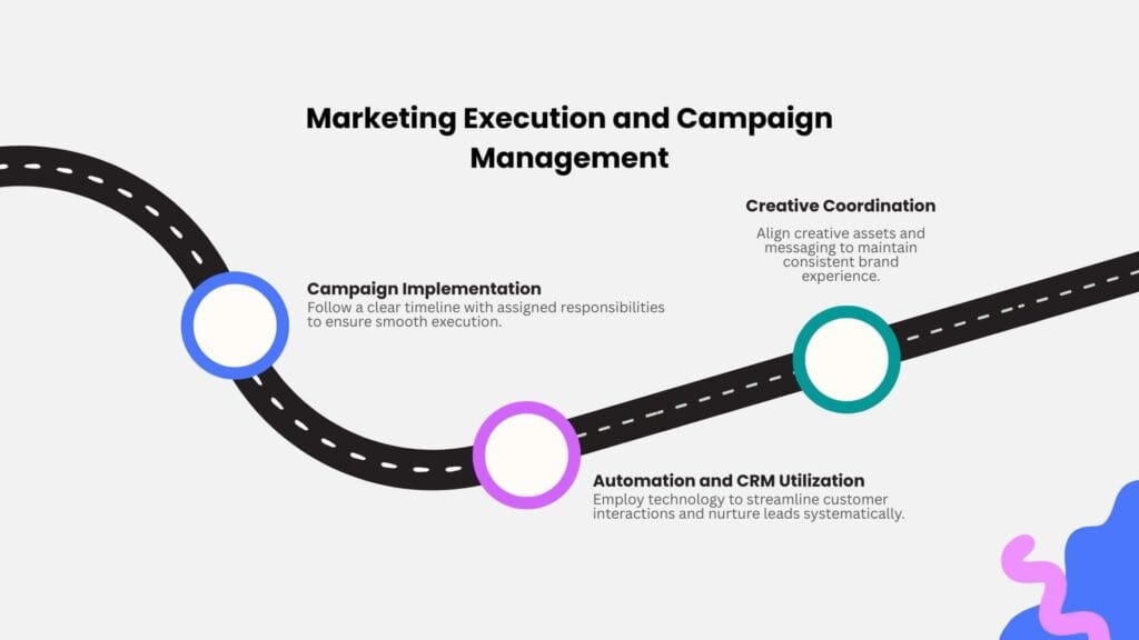
Persuasion & Pitches: Startup Decks, TED-style Talks That Depend on Rhythm and Pace
In persuasive contexts—whether it’s a startup pitch, a TED talk, or any presentation that relies on momentum, rhythm, and visual impact—the widescreen format offers some clear advantages. It enables stronger visual pacing: you can “slide in” an image or data point from the right or left, use side-by-side comparisons, or create spatial builds instead of just stacking elements. The extra horizontal space also lets you craft dramatic reveals. For example, showing a problem on the left, introducing a solution in the center, and highlighting the impact on the right.
Practical tip: In a pitch deck, consider slide sequences that visually span left->right: e.g., “Problem → Opportunity → Solution” as a horizontal movement rather than three discrete vertical slides.
Data-Heavy Contexts: Finance, Engineering, or Design, Where Side-by-Side Visuals Matter
When dealing with technical content—engineering diagrams, scientific charts, spectroscopic graphs, or design schematics—the widescreen format offers clear advantages.
In engineering or instrumentation presentations, clarity and spatial layout matter, and using 16:9 makes sure that data-rich content doesn’t feel squeezed. You can place a table or chart on the left and a visual, like a photograph, schematic, or instrument photo, on the right, allowing for immediate comparison.
It also lets the presenter show two or three metrics or visuals side by side without them feeling cramped. The extra horizontal space gives axis labels, legends, and annotations room to breathe, avoiding the need to cram everything onto a narrow vertical slide.
Practical tip: When showing a spectroscopic graph and its interpretation, you can use the left half of the slide for the raw graph and the right half for annotated explanations, taking advantage of the rectangular format to keep both visible at once.
How to use the Square format in PowerPoint presentations?
Focused Communication: One Idea, One Centered Message
The 4:3 layout gives a stable, focused field of view, making it perfect for slides built around a central figure or message.
It’s ideal when the presenter wants the audience to lock onto a single idea. The more balanced, almost square composition naturally draws the eye toward the center, reducing distractions from the background. When presenting research findings, core concepts, or reflective ideas, 4:3 makes the slide feel calm and deliberate rather than sprawling.
It works especially well for key takeaway slides, title cards, or quotes. With a tight ratio like 4:3, the presenter can isolate a single chart or visual in the center without needing to “fill” the sides.
Practical tip: Use 4:3 for “anchor” slides, for the moments where you want to pause the audience’s visual journey and let a single idea fully register.
Human-Scale Framing: Teaching and Interview Settings
Like in a movie with a tighter frame, choosing your slide proportions can shape the emotional tone. A narrower frame feels intimate and direct.
When the presentation includes people(lecturers, interviewees, or presenters), the 4:3 frame feels works well because it feels more personal.
It aligns naturally with the human body and face within the visual field, keeping attention centered on the speaker rather than drifting to peripheral visuals. This makes it perfect for tutorial videos, teaching decks, or recorded lectures, where the goal is to have a balanced head-and-shoulders composition when embedding a presenter video.
Practical tip: In hybrid or recorded talks, frame your video window within a 4:3 slide. This helps the speaker remain proportionate and visible across devices.
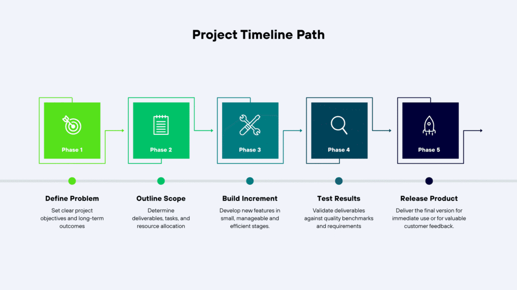
Structured Storytelling: Sequential Logic and Stepwise Thinking
Constrained visual fields can enhance narrative pacing. Each frame delivers a self-contained beat.
Because 4:3 offers less lateral space, it creates a tighter narrative discipline on presentation slides. Each slide becomes a distinct chapter rather than a panoramic scene.
But this doesn’t mean 4:3 can’t be used for storytelling.
It just means each slide should focus on a single central idea; a separate chapter, rather than a continuing narrative that works better in a wider frame.
This approach works best in analytical or scientific storytelling, where the goal is to reveal one concept at a time, each step building logically on the last.
It works especially well when the presenter is an expert in the subject they’re discussing, having spent years researching it. In these cases, each point can be developed fully to support one central idea. The presentation becomes structured storytelling, ideal for method explanations, experimental sequences, or policy frameworks, where ideas are vertically stacked to mirror how we read and absorb stepwise reasoning.
A perfect example is Steven Pinker’s linguistics talk. He’s done so much research for so long that every slide hits one clear idea, and together they build into a bigger story.
Practical tip: For complex material (e.g., lab methods or theoretical models), structure each slide as a “step”, not a spread, so the audience processes one key idea at a time.
Conclusions
Even though everything around us has shifted to wider, rectangular screens, the aspect ratio of a presentation is still something we get to choose. It’s not just a technical detail, it actually shapes how your audience sees and feels your message, just like how movie frames affect how we feel a scene. The best way to approach it is to understand how different aspect ratios speak to different audiences, and use that intentionally to get your message across. A 4:3 slide can make an idea feel more personal and focused, while a 16:9 or wider frame makes it feel like it’s unfolding, more like a story in motion. The frame itself becomes part of the storytelling.
FAQs
What is the best aspect ratio for presentation slides?
The choice of aspect ratio in a presentation comes down to the symmetry between the presenter and the audience.
The 4:3 layout, for instance, gives a stable and centered frame; perfect for slides built around one main figure or message. It works best when you’re following a “one idea per slide” approach, keeping the audience locked on what matters most.
The 16:9 layout, on the other hand, lets the eye wander rather than just scan down. It gives the presenter more space for visuals and narrative flow, making it ideal for talks that take the audience through a journey, the progression of a project, the evolution of an idea, or even a hero’s arc.
When should I use a 4:3 slide format?
A 4:3 slide can make an idea feel more personal and deliberate. This format works best when each slide is meant to deliver one central message. With its tighter, almost square frame, there’s less room for the audience’s eyes to wander, their attention naturally locks onto the center, right where you want it. It’s also a great choice when the presentation includes people because the 4:3 frame feels more intimate and human, keeping the focus on the speaker rather than the surroundings.
Why is 16:9 the default slide size in Microsoft PowerPoint and other tools?
Rectangular aspect ratios, especially 16:9, dominate the modern world mainly because of their technical advantages over square or near-square formats like 4:3. In fields like filmmaking or photography, that dominance makes sense; those industries are tied to sensors, screens, and production costs. But when it comes to PowerPoint presentations, we’re not bound by any of that. It’s purely a choice. That’s why it’s worth understanding the psychological differences between 16:9 and 4:3, so we can use each format intentionally, depending on what kind of message or experience we want our audience to have.
Can I change the slide size after I’ve designed the presentation? What happens to the content?
Yes, you can change the slide size even after finishing your presentation. But it needs to be done carefully to avoid making errors in your original layout.
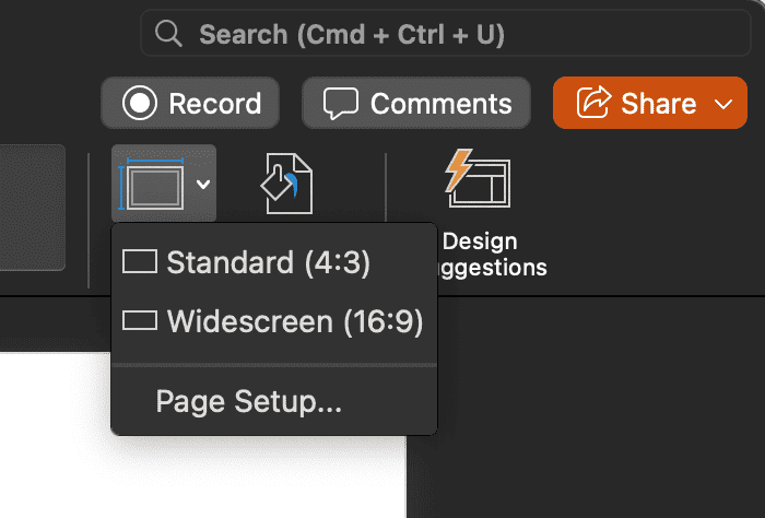
Here’s the right way to do it: Go to the Design tab → click Slide Size → Custom Slide Size → choose your desired format (16:9 or 4:3) → and hit OK. When PowerPoint asks, you’ll see two options:
– Maximize, which keeps everything large (but parts might get cut off), or
– Ensure Fit, which scales everything down to fit the new dimensions.
Switching formats can cause text boxes, images, and charts to shift or resize slightly, so you’ll probably need to tweak a few slides afterward. The safest approach is to duplicate your file first, pick Ensure Fit for consistency, and then fine-tune the alignment and visuals manually.
Is 4:3 still relevant today, or is it outdated? Is the 4:3 vs 16:9 aspect ratio a debate at all?
The 4:3 aspect ratio is still very much relevant today, even though 16:9 dominates modern screens mainly because of its technological advantages. A tighter frame like 4:3 continues to appear in movies, photography, and presentations; anywhere the focus needs to stay on a single, central subject. In presentations, the 4:3 layout creates a stable, centered field of view that naturally draws the audience’s attention to the core message. It’s especially effective for “one idea per slide” presentations, where clarity and focus matter more than visual width or movement.
What’s the difference between aspect ratio and slide dimensions or pixel size?
Aspect ratio is the ratio between a slide’s width and height. For example, if a rectangular screen measures 6 by 3, its aspect ratio is 2:1. It defines the overall shape of a slide or screen without specifying its actual size.
The most common aspect ratios for presentation slides are 16:9 (widescreen) and 4:3 (standard).
Slide dimensions or pixel size, on the other hand, refer to the absolute size of the slide, in inches, centimeters, or pixels (for example, 1920×1080 px). This determines the physical or digital resolution and how sharp images appear.
It’s possible to have slides with the same aspect ratio but different pixel dimensions. This changes image quality, not the proportions.
In short: aspect ratio defines shape, while slide dimensions define size and clarity.
Does choosing the wrong aspect ratio affect how the audience perceives my message?
Yes, because aspect ratio directly affects how an audience perceives, follows, and focuses on a presentation.
For example, if your goal is to emphasize one clear idea per slide, a tighter aspect ratio like 4:3 is the best choice. Its near-square shape naturally keeps the viewer’s attention centered, preventing the eye from wandering.
On the other hand, if your goal is to tell a story or show progression, a wider format like 16:9 works better. The extra horizontal space encourages the audience to explore the slide, moving from left to right, creating a sense of momentum and dynamism that supports narrative-driven presentations.
How do I choose the right aspect ratio for a mobile-first or social-media-friendly presentation?
Choosing the aspect ratio of a presentation has more to do with the message you want to deliver than the medium it’ll be shown on, whether that’s a mobile screen, social media, or a projector.
Unlike movies or photography, PowerPoint has no real technical restrictions when it comes to aspect ratio. You can switch between 4:3, 16:9, or even custom formats freely.
That means the choice should be guided entirely by what kind of message you want to bring across, whether you want your audience to focus closely on a single idea or travel through a broader, more dynamic story.
What are the common mistakes when picking a slide aspect ratio?
One of the biggest mistakes people make when designing presentations is not being clear about the type of message they want to deliver in the first place.
For example, if the goal of the presentation is to tell a story or walk the audience through a roadmap or a journey, then choosing a 4:3 aspect ratio is a poor fit. The tighter frame doesn’t give the audience the breathing room they need to feel the flow or movement of a storyline.
On the other hand, if the goal is to communicate one key idea per slide, going with a 16:9 aspect ratio can backfire. The wider frame naturally draws the audience’s eyes across the slide, making it harder for them to stay focused on that single, central message.
Does it matter which slide aspect ratio I use for online meetings (Zoom, Teams) vs live in-room presentations?
Not necessarily. The slide aspect ratio itself doesn’t inherently matter for online versus in-room presentations.
What it does affect is how the content is displayed on different screens. The key is to choose an aspect ratio that suits your content and makes sure that it remains clear, balanced, and visually effective whether your audience is viewing it in a physical room or online.