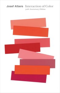
Snapshot
For a book in this genre, Interaction of Color by Joseph Albers takes a different approach and leans more towards philosophy than just facts.
To me, this is what makes the book really enjoyable.
The book is structured as a teaching guide, filled with bite-sized lessons and exercises using colored illustrations. But even outside a classroom, it reads as an accessible and thought-provoking study of how color behaves in our day-to-day lives.
Table of Contents
Color Is Contextual
Albers starts by pointing out something surprisingly intuitive: our visual memory is far poorer than our auditory memory. Most of us can hum a melody we heard just once. But if asked to recall a specific color, even something we’ve seen countless times, we struggle with it.
As he puts it:
“If one says ‘red’, and there are 50 people listening, it can be expected that there will be 50 reds in their minds.”
This sets the tone for the whole book. Color, Albers argues, is deeply contextual. It doesn’t exist as a fixed property but in a relationship with light, surroundings, memory, and even language.
From this, he makes one of the most interesting arguments: light and color are completely different from each other. Light refers to a wavelength and is objective. But color is what our brain assigns to a specific wavelength, so it’s subjective.
Primary Colors and Color Systems
Albers points out that the concept of “primary colors” isn’t universal. It depends on the field:
- Painters: yellow, red, and blue
- Physicists: red, green, and blue (for additive mixing)
- Psychologists: red, yellow, blue, and green(with black and white as the “neutrals”)
The color wheel itself can take many forms, from simple triads to equilateral triangles subdivided into more complex systems, blending primaries, secondaries, tertiaries, and their mixtures.
Why Complementary Colors Look So Good Together
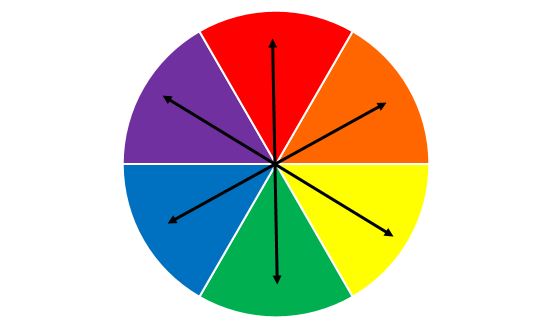
Complementary colors—pairs like red and green or blue and orange—are directly opposite each other on the color wheel. The most interesting fact about them is that when mixed, they create white. That’s where the name comes from: they’re a complete set (because the color white is a combination of all the colors).
They create a strong contrast because of how our visual system responds to opposing wavelengths. When we see a complete set of complementary colors in a graph, a painting, or even a photograph, we unconsciously decide what we’re looking at as complete. It’s easy to look at, and pleasant too. Our eyes are naturally drawn to this contrast.
Designers use this to their advantage. Pairing a warm color with its cool opposite creates balance, tension, and vibrancy. It’s a trick of biology that’s been used in art for centuries.
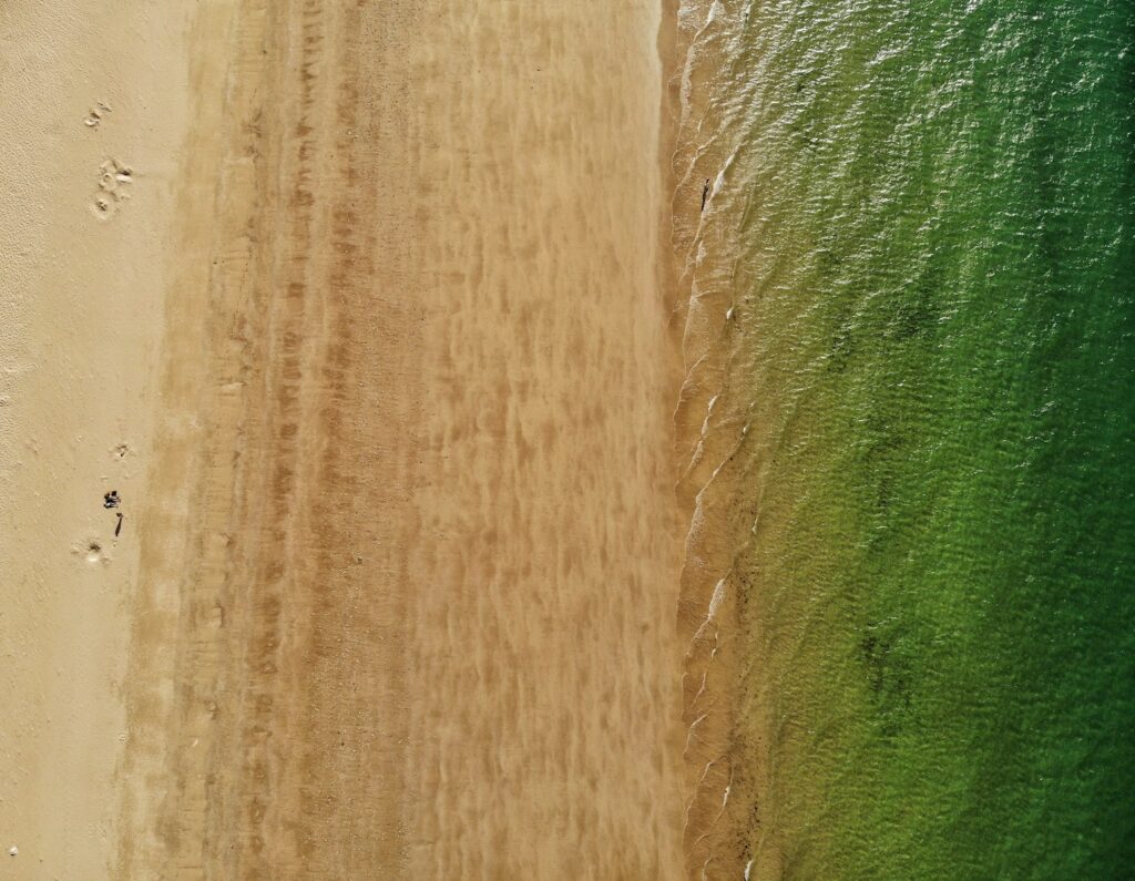
Here are some examples of complementary color pairs in action:


Why Do We See Color? (The Trichromatic Theory)
The trichromatic theory explains that we see color through three kinds of cone cells in the retina, each tuned to a different wavelength: red (long), green (medium), and blue (short). All the colors we identify are formed by varying levels of stimulation in these three cones. For example, if your red and green cones are strongly stimulated, your brain interprets that as yellow.
This is why digital screens use RGB. By mixing different intensities of red, green, and blue light, they can mimic the entire visible spectrum.
It’s a reminder that color, as we know it, is a constructed experience. It doesn’t live out there in the world. It’s something our brains create. Our brain reads a wavelength and then assigns a color to that wavelength.
“Colors and hues are defined, as tones in music, by wavelengths. Light, which is perceived as color, is electromagnetic, but sound is mechanical.”
Color Perception and Illusion
The central theme of the book is the illusion of color: how we don’t recognize color objectively, and how that can be used deliberately in design. Albers even warns:
“He who claims to see colors independent of their illusionary changes fools only himself and no one else.”
The examples he gives are really interesting. For instance, one exercise shows that when we stare at a red circle for half a minute, and then shift to a white circle, we don’t see white at all. We see green, which is red’s complementary color.
Why?
Because the red-sensitive cones in our retina have been fatigued. So when we look at white light (which is made of all colors), we see only the parts our eye can still process: yellow and blue, and that makes green.
The point is that color isn’t a constant. It changes depending on what’s around it, what came before, and how our eyes are responding.
Color Reading and Contexture
There’s a parallel here with language. Albers notes:
“We do not read letters—we read words. Therefore, capital letters present the most difficult reading—because of their equal height, equal volume, and their equal width.”
Just like we interpret words as a whole rather than individual letters, we read color in context. Identifying a paint’s hex code or pigment makeup doesn’t translate to seeing it. Albers writes:
“A factual identification of colors within a given painting has nothing to do with sensitive seeing, nor with an understanding of the color action within the painting.”
It’s the interaction that matters, not the individual colors in isolation.
On Black and White Photography
Albers also touches briefly on photography. In black and white, he writes:
“Black and white photography registers all lights lighter and all darks darker than the more adjustable eye perceives them.”
It’s a reminder of how much nuance is lost when light is stripped of its color, especially those middle greys that our eyes are particularly sensitive to, but which often get flattened in photographs.
On the surface, this looks like a disadvantage that black and white photography has over color photography. However, there’s a hidden advantage. Too much contrast in color photography can be a problem, too, especially when the photographer is trying to capture more than just the scene but the feeling within it; for example, in street photography.
It’s too easy to get lost in the vivid colors of a photograph and totally overlook the human condition that the photographer originally intended to bring through. Black and white photography in this case is much more direct, forcing the viewer to see the subject rather than the scene.
But then the question becomes: how to balance the midtones, which our eyes are most sensitive to, in such a way that it helps deliver the right message? The best way to do this is what almost all the great black and white photographers did: play around with the midtones to convey the message they wanted in the most accurate way possible.
The Evolutionary Mapping of Color
All these ideas raise a question: has the color that our brain assigns to a specific wavelength changed over time? The wavelength itself is objective. It’s just physics. But color, as we perceive it, is entirely up to the brain. We usually treat color as if it’s universal, but maybe that’s only because all human brains are wired similarly.
Still, color perception isn’t just about biology. It’s also shaped by context and meaning. For example, red tends to signal danger: blood, warning signs, fire. But who’s to say it was always the case? Over the course of millions of years, it’s entirely possible that the associations our ancestors made with certain wavelengths were completely different.
What’s more interesting is that early humans didn’t have the same visual system we do now. At one point, we only had two types of cone cells, which means our ancestors were probably seeing the world through a different palette altogether. So even if the grass has always reflected the same wavelength of light, the color our brain assigns to it today might be completely different from how it looked a million years ago.
It’s interesting how certain colors seem to carry emotional weight. Red, in particular, conveys danger. And that raises the question of whether it’s because of how we evolved. A good example is blood. When we get cut, it’s a dangerous event, and blood is one of the most immediate visual signals of injury. Blood happens to reflect light at around 600-700 nm, and it makes sense that over time, our brains began associating that specific wavelength with danger.
It’s interesting how certain colors seem to carry emotional weight. Red, in particular, conveys danger. And that raises the question of whether it’s because of how we evolved.
The connection between red and danger likely comes from multiple sources: blood, fire, poisonous animals, and even the way our skin flushes when we’re angry or threatened. Blood reflects light in the 600-700 nm range, which our brains label as red. But the association probably didn’t develop just from seeing injuries. Research shows that red awareness may have evolved first for spotting ripe fruits, and later became tied to social signals and threats through multiple channels.
So now, that same wavelength, regardless of the context, gets labeled as red by our brains. A flower, a traffic light, or a piece of clothing might all reflect the same light, but it’s that early emotional imprint, probably linked to survival, that made red stand out in the first place.
But our ancestral instincts still remain. It doesn’t matter how harmless an object is, like a red flower or a red road sign. Exposure to red increases heart rate and blood pressure. It activates the fight-or-flight response. The emotional weight a certain color carries seems to be hardwired into how we process the world.