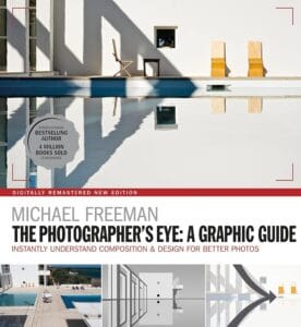
What separates simply “showing something” from capturing a truly compelling photograph is composition. The Photographer’s Eye by Michael Freeman provides exactly what you need to turn casual snapshots into intentional, visually engaging images.
Table of Contents
Summary
A book that covers the entire arena of techniques
It’s hard, at least from what I’ve read so far, to find a book that gives an in-depth yet concise description of “all the basics” in photography. The Photographers Eye fills that void. I find it interesting that no matter what type of photography you’re into, at least 60–70% of the content will be useful for anyone. Here are the topics covered:
Framing, Placing, Dividing, Graphics, Viewpoint, Optics, Motion, Color, Juxtaposing, Combining.
The book leads with photos, not just words
The book is as visually rich as it is knowledge-rich. Michael Freeman shows his own work and cleverly leaves out the bloated descriptions, focusing only on the points that matter.
Below are my takes on each and every section of the book.
Framing
This section shows how framing affects the final image and how to use it to your advantage. Two subsections that really caught my attention were square framing and offstage framing.
- Square framing
- Square framing is not widely used for a reason: the equal sides give a sense of strictness and formality. In other words, it’s extremely hard to impose a “bias” into a photograph when working with a square format, especially if there are people in the frame. This led me to think about the opposite discussion: how can we use the bias of a non-square frame to our advantage as photographers?
- There are two main possibilities: vertical bias and horizontal bias.
- A vertically longer frame emphasizes height and hierarchy (a mountain or a tall tree), creating a sense of elevation and drama when done well.
- A horizontally longer frame gives a sense of narrative. This is why movies are made horizontally: the audience naturally feels the urge to “look around” the frame, making it ideal for storytelling.
- Offstage framing
- Offstage framing is particularly useful in street photography. William Klein is one of the masters of this approach. You photograph a movement, often a collective movement of people, while keeping the object they’re looking at hidden from the frame. This makes the viewer scan the scene and think, effectively making them a part of the photograph.
Placing
Where you place your subject in the frame leads to interesting discussions. What I like about this section is that Freeman explains why certain placements work better than others.

For instance, off-centering the main subject is common in both photography and cinematography. Characters in movies are rarely centered because it looks better off-center. Freeman explains why:
“Off center has two strong things going for it. First, it’s natural rather than forced or exact. Second, it creates an easy but definite relationship between the subject and the background.” (p. 32)
I also liked the “reveal” technique, where a large structure dominates the frame and the subject is positioned small at the edge. This is common in cinematography but is extremely effective in photography as well.
Dividing
This section explores effective ways to divide the frame. One interesting concept is “eccentric dividing,” where one element takes up more of the frame to emphasize the important part. Freeman shows an example of a river in Brazil, where the river is almost completely cropped to highlight the dramatic clouds.

This principle works both ways. If the bottom of the frame is more interesting, it can make sense to crop the top nearly entirely. Ansel Adams’s photos often illustrate this effectively.

Graphics
This is one of the most visually satisfying chapters. It shows how visual elements can be used to emphasize what the photographer wants the viewer to notice. Some effective techniques include:
- Horizontal and vertical lines
- Diagonals (a cornerstone of street photography)
- Curves
Viewpoint
The camera’s viewpoint makes a huge difference in how a photo is perceived. Freeman provides many examples showing why viewpoint matters. One fact I found especially interesting is that horizontal and vertical alignments work well with headlines, mastheads, and typography in magazines. So aligning subjects and objects along these lines can make an image feel more integrated and harmonious.
This chapter is also where I first disagreed slightly with Freeman. In “High” (p. 84), he shows several photos of a lighthouse and ultimately chooses an abstract shot. Personally, the one with the boat feels more balanced and pleasing.
Optics
This is the technical section of the book, explaining how to use your camera to convey a scene effectively. One technique I wasn’t familiar with is what he calls the Tilt (p. 112), which is based on the Scheimpflug Principle.
In simple terms, the typical plane of focus is parallel to the lens. Tilting the lens relative to the sensor changes where the plane of focus appears, giving you control over which parts of the scene are sharp.

Why it matters:
- Landscape photography → Tilt the lens so both foreground and background are in focus without needing a tiny aperture.
- Product photography → Keep an entire object sharp even if it’s angled.
- Creative effects → Tilt-shift lenses can blur most of the scene, creating a miniature-like effect.


Learn more about Scheimpflug principle here.
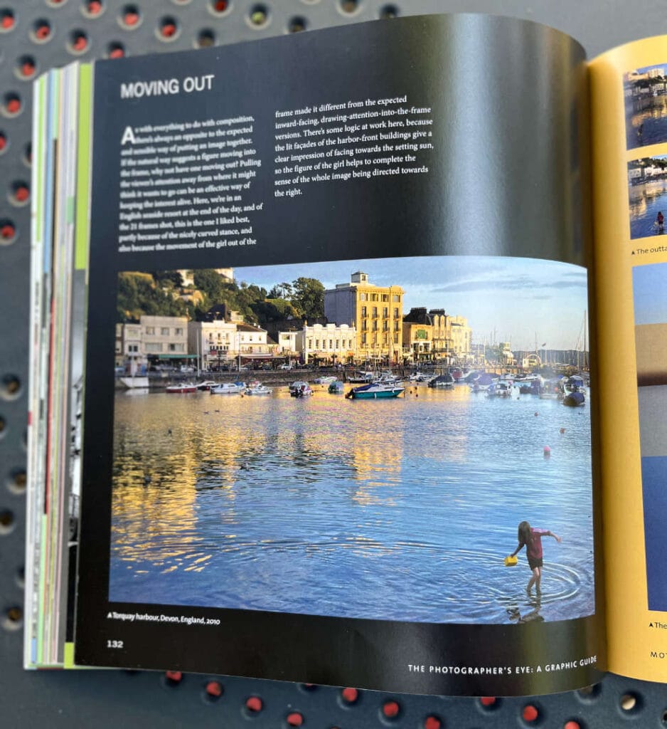
Motion
Motion is used to communicate a story, and placing moving subjects correctly is as important as capturing their movement. For example, if a person moves out of the frame while buildings in the background face the same direction, the combination can create a strong sense of flow and narrative.
Color
This chapter emphasizes both the use and careful application of color. Key points:
- Complementary colors (opposite on the color wheel) are pleasing to the eye.
- Adjacent hues on the color wheel create harmony.
- Contrast can emphasize or isolate the main subject.
- Black and white can be a creative ally for street photography.
Juxtaposing
Juxtaposition sets one element against another in the frame, a basic but powerful technique in photography. The “near-far” method is a classic example, showing two connected subjects at different distances in the same frame.
Combining
This section discusses combining multiple photos as a collage, especially useful in product photography where the goal is to showcase many items in one composition.
Ideas that resonate with me
1. Framing: Film vs. Digital
As someone who primarily shoots film, the Framing section made me reflect on my process. Most shots in the book are digital. I’ve always felt film photography teaches discipline: you think 80% of the time and shoot 20%. With digital, it’s often the opposite.
That said, the book makes a strong case that shooting a series of photos can enhance creativity, which is much easier with digital photography. Does this change how I think about film? Not entirely. But for a novice, shooting both film and digital seems ideal: start with film to build discipline, then move to digital for flexibility and experimentation.
2. The book appeals to many photography genres
It’s refreshing to see a photography book useful to almost any type of photographer. Whether you’re into street, landscape, fashion, or product photography, there’s something here to learn and apply.
Parts that left a mark on me
Henri Cartier-Bresson, one of the true masters of composition, had a habit that perplexed many and annoyed some. When he looked at a photographer’s contact sheets, which he did often, he turned the pictures upside down to look at them(p. 7).
Lenses are not just optics; they can also deliver sensation and impression, which ultimately will get you more attention from an audience(p. 118, Wide-angle immersive).
With busy scenes, one of the problems is finding a way to make elements cohere, to pull together in some way rather than seem completely haphazard. Sometimes the camera angle can do it, or the light , but often you have to rely on the way the action unfolds. Rely may be the wrong word, because things often don’t work out, and you end up with just a busy scene(p. 170, action coincides).
Coffee chat
Summarize The Photographer’s Eye: A Graphic Guide in one paragraph.
Freeman’s book is essentially a visual toolkit for thinking about photographs before you even click the shutter. Instead of presenting rigid “rules,” he walks you through how framing, geometry, rhythm, balance, and proportion shape the way we ”see” a photograph. Each idea is backed up with his own photos. The book isn’t about telling you what to shoot — it’s about teaching you how to see.
Describe the main themes of The Photographer’s Eye for beginner photographers.
The main themes revolve around ‘how structure creates meaning’. Freeman emphasizes framing (how much you choose to include or exclude), balance (how the eye is drawn across the frame), and rhythm (patterns and flow within an image). For beginners, the real takeaway is that composition isn’t ‘decoration; it’s the foundation that makes a photograph feel intentional rather than accidental.
Give me three ways Freeman’s book can change how I take pictures.
- You’ll start noticing geometry everywhere; lines, diagonals, and curves that guide the eye.
- You’ll become more deliberate about framing, asking “what happens if I include this but leave out that?”
- You’ll pay closer attention to rhythm, whether repeating shapes, movements, or contrasts, to give photos a stronger sense of flow.
How does this book differ from other photography guides on composition?
Most composition books boil down to “rule of thirds” and a handful of tricks. But that’s just mostly it. Freeman takes it deeper. He draws on design, art history, and even psychology to explain why certain compositions feel balanced or dynamic. It’s less of a “how-to” manual and more of a graphic conversation about seeing. The book is not bloated. It directly goes to the point and backs that point up with the best way possible: with photographs.
Is The Photographer’s Eye useful for street photography, landscape photography, or both?
Both, and that’s the most interesting thing about it. The principles are universal: balance, proportion, and framing matter whether you’re capturing the energy of a crowded street or the quiet symmetry of a mountain range. For street photography, Freeman’s ideas about rhythm and timing stand out for me. For landscapes, his discussion of proportion and balancing is extremely valuable.
Parts that made me pause and think
What are the best lessons from The Photographer’s Eye by Michael Freeman?
The best lessons are that composition is fluid, not fixed, and that every choice(frame, angle, balance) adds or subtracts meaning. I also found his emphasis on proportion (like the 16:9 vs. square frame debate) particularly thought-provoking, because it forces you to ask not just what you’re shooting, but how the format itself biases perception.
What does Michael Freeman say about framing and composition that really stands out?
He makes the case that framing isn’t just a border around your subject; it’s an active decision-making tool. By including or excluding even a small detail, you change the narrative of the photograph. That shift from “frame as container” to “frame as statement” really stood out to me.
Which quotes from The Photographer’s Eye inspire photographers the most?
- “Off-center has two strong things going for it. First, it’s natural rather than forced or exact. Second, it makes for an easy but definite relationship between the subject and the background(p. 32).”
- “Lenses are not just optics, they can also deliver sensation and impression, which ultimately will get you more attention from an audience(p. 118, Wide-angle immersive).”
- “With busy scenes, one of the problems is finding a way to make elements cohere, to pull together in some way rather than seem completely haphazard. Sometimes the camera angle can do it, or the light , but often you have to rely on the way the action unfolds. Rely may be the wrong word, because things often don’t work out, and you end up with just a busy scene(p. 170, action coincides).”
How does Freeman explain balance, rhythm, and proportion in photography?
He treats them almost like physics for the eye. Balance is about visual weight, where your eye naturally settles and whether it feels stable or tilted. Rhythm is about repeated elements that create flow, much like beats in a song. Proportion is about how much space different elements take up and how the shape of the frame (square, 3:2, 16:9) influences the emotional tone.
What are the most practical takeaways from The Photographer’s Eye: A Graphic Guide?
The most practical lessons are to:
- Use framing intentionally, not just instinctively.
- Pay attention to the “flow” of a picture, not just its subject(especially the balance between the subject and the background).
- Think about aspect ratio early on, since it can completely change the mood.
How did the book change the way I think?
With busy scenes, one of the problems is finding a way to make elements cohere, to pull together in some way rather than seem completely haphazard. Sometimes the camera angle can do it, or the light , but often you have to rely on the way the action unfolds. Rely may be the wrong word, because things often don’t work out, and you end up with just a busy scene.