I’ve been in academia for more than a decade, and choosing the right color is still something I think about every single time I make a new presentation or poster.
It’s hard for a reason.
An average person can tell apart nearly a million different colors. That’s a lot. So choosing just two or three of them for a scientific presentation can feel overwhelming.
Yet the color scheme you choose is almost as important as the data you present. Colors influence attention, comprehension, and credibility, often subconsciously. When the colors aren’t right, it leads to unappealing visuals, distracted audiences, and negative feedback, even when the science itself is pretty strong.
A well-designed color palette, on the other hand, can elevate a good presentation into a memorable one. It improves clarity, encourages positive engagement, and helps the audience focus on your message rather than the slides.
This guide explains how to choose effective, professional, and accessible colors for a scientific presentation using a simple, three-step process grounded in color theory, audience psychology, and real-world academic feedback.
Table of Contents
Why Most Scientific Presentations Get Color Wrong
One of the biggest mistakes is that many presentation designs focus on branding or visual flair. In scientific contexts, these designs fail more often than not because:
- They rely on default PowerPoint or Keynote themes,
- Use too many saturated or competing colors,
- Ignore projector and lighting limitations,
- Apply marketing color psychology without considering data visualization,
- and overlook accessibility, including color vision deficiencies.
Scientific slides should prioritize clarity, consistency, and legibility over decoration. The colors shouldn’t get in the way of what you’re trying to communicate.
Here’s how to choose the right colors in three steps.
The Three‑Step Process to Choose the Right Colors for a Scientific Presentation
Step 1: Determine Your Goal and Audience
Before choosing any colors, define the purpose of your presentation and, most importantly, your audience.
Ask yourself:
- Are you informing, educating, or persuading?
- Is this a conference talk, thesis defense, journal club, or poster presentation?
- Will the slides be viewed on a projector, monitor, or in print?
In scientific settings, professionalism and clarity matter. Sticking with two to three core colors is usually the best choice. More than three colors can overwhelm the audience and dilute the entire visual hierarchy.
A useful way to think about this process:
- Understand your audience and their expectations,
- Clarify your own objective for the presentation,
- and focus on the overlap between audience needs and your goals.
Once this is clear, color choices become far more straightforward.
Step 2: Learn the Basics of Color Theory
Using multiple colors without understanding how they interact is one of the biggest reasons why some presentations and posters look chaotic. This is one of the reasons why default software themes often fall short.
The best and easiest way to understand how color combinations influence perception is through color theory.
What Is Color Theory?
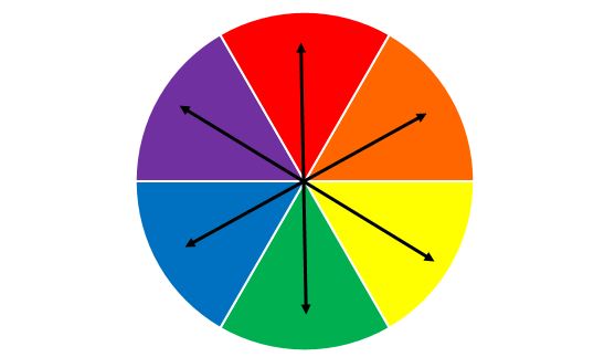
Color theory explains how colors relate to one another and which combinations are visually harmonious. The color wheel is its foundation.
At a minimum, understanding complementary and analogous colors will go a long way.
Analogous colors sit next to each other on the color wheel and create calm, cohesive designs. Complementary colors sit opposite each other and create strong contrast, but can visually vibrate if overused, especially on projectors.

For scientific presentations, analogous or near-neutral palettes are usually safer and more readable.
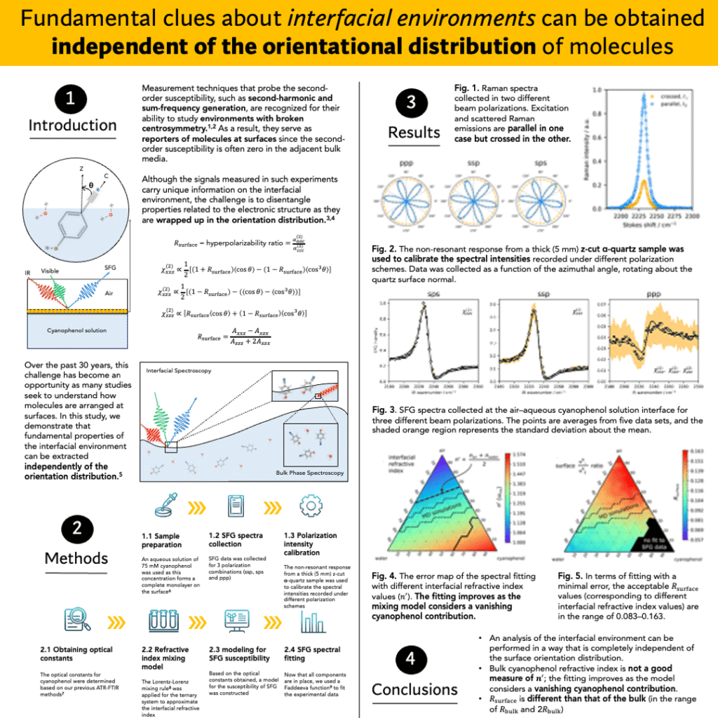
But this depends on the context. For a presentation, I get the most positive feedback when I use analogous colors. For a poster, I get better results with complementary colors. This is because a poster needs to draw attention to itself in a crowded room, while a presentation needs to draw attention to the speaker—to you—more than to the slides.
For example, here’s one of my posters that got the most positive feedback, even though the color choice was unconventional for a scientific poster.

How Colors Are Perceived
Colors carry emotional and cognitive associations. While these vary by culture, common Western interpretations include:
- Red: urgency, intensity (best used sparingly)
- Orange: warmth, energy
- Yellow: attention, optimism
- Green: balance, nature
- Blue: calm, professionalism, trust
- Purple: creativity, luxury
- Black: authority, discipline
- White: clarity, cleanliness
In academic contexts, blue, green, gray, and neutral tones tend to perform best, especially under artificial lighting.
Step 3: Be Specific and Inclusive
Even perfect color theory fails if part of your audience can’t see your slides properly.
Approximately 8–10% of people have some form of color vision deficiency. To make your presentation more inclusive: increase contrast between colors, avoid relying on color alone to convey meaning, use patterns, labels, or shapes in graphs, and test slides with color-blind simulators when possible.
Also remember that projectors, monitors, printers, and posters rarely reproduce colors identically. You might have the most appealing and inclusive color palette on your personal computer, but when it’s plugged in somewhere and projected onto a wall, you might see a completely different result.
The way to deal with this is to design slides for luminance contrast, not hue contrast. Color blindness affects hue discrimination far more than light-dark perception.
Practical Rules for Choosing a Scientific Color Scheme
Prioritize High Contrast
High contrast is crucial for readability. Dark backgrounds require light text; light backgrounds require dark text. Contrast is not just about color choice but also about saturation and brightness.
Avoid using fully saturated “pure” colors everywhere. Instead, combine tints, shades, and tones to create visual hierarchy.
Keep It Simple
Less is almost always more. Three to four colors, including background, text, and accent, are enough for most scientific presentations.
Use the 60‑30‑10 Rule
A simple way to maintain balance:
- 60% primary color (background)
- 30% secondary color (content areas)
- 10% accent color (highlights, key results)
This prevents visual clutter and helps guide attention.
Design for Data, Not Decoration
Scientific slides often include plots, spectra, microscopy images, and schematics. Choose colors that:
- Remain distinct in grayscale
- Avoid red–green pairings in graphs
- Stay consistent across all figures
- Do not overpower the data itself
A useful test is to convert slides to grayscale. If they still read clearly, that means that your color choices are likely effective.
Final Thoughts
Effective scientific presentations prioritize clarity over creativity and communication over decoration. Thoughtful color choices help your audience focus on your ideas, your data, and your conclusions.
By first defining your goal, applying basic color theory, and designing inclusively, you can create slides that look professional, communicate clearly, and enhance the science rather than distract from it.
FAQ
What are the best colors for a scientific presentation?
The best colors are usually blue, green, gray, and neutral tones because they remain readable under projectors and convey professionalism. These colors help your audience focus on the data rather than the design. Bright or highly saturated colors should be used sparingly as accents.
How many colors should I use in a scientific presentation?
Most scientific presentations work best with two to three core colors. Using more than three easily creates visual clutter and makes it harder for your audience to follow the content. Simplicity improves clarity and credibility.
Why do default PowerPoint or Keynote themes look unprofessional for scientific talks?
Default themes are designed for general use, not data-heavy scientific content. More often than not, they’re only good for printing, not presenting. They often rely on strong contrasts, saturated colors, or decorative gradients that interfere with graphs and readability.
Just a simple white background and one or two well-chosen colors would be a much better choice.
How do colors affect audience understanding and attention in scientific presentations?
Colors influence our attention, comprehension, and perceived professionalism, often subconsciously. Poor color choices distract the audience, while well-chosen, clear, and consistent palettes help them process information more easily. Good color design supports learning rather than competing with it.
What color combinations should I avoid in scientific slides?
Red–green combinations are difficult for many viewers to distinguish and should be avoided, especially in graphs. Highly saturated complementary colors can also visually vibrate on projectors and can be distracting. Neutral palettes with clear contrast are the safest option.
Should scientific presentations use dark or light backgrounds?
The contrast matters more than the background. Both dark and light backgrounds can work if the contrast is handled properly between the background and the foreground; letters, figures, and so on.
That said, light backgrounds are often better for printed materials and posters, while dark backgrounds can work well in lecture halls. The key is high contrast between text and background.
How can I choose colors that work well for graphs and data visualizations?
Choose colors that remain distinct in grayscale and are consistent across all figures. Avoid relying on color alone to convey meaning and test your figures by converting them to black and white. If they look clear in black and white, that means they’ll maintain clarity in all viewing conditions.
How do I make my scientific presentation color-blind friendly?
Increase contrast, avoid red–green pairings, and use labels or patterns in addition to color. About 8–10% of people have some form of color vision deficiency, so inclusive design improves accessibility for a large audience.
Does color choice really affect how professional my research looks?
Yes, color choices strongly influence perceived professionalism and credibility. Clean, restrained palettes signal clarity and rigor, while busy or flashy colors can make strong research appear less serious.
How do I choose colors for different scientific presentation formats (talks, posters, thesis defenses)?
Conference talks, posters, and thesis defenses have different needs. For example, in a talk, you should be the center of attention, the speaker. But in a poster, the focus leans more toward the poster itself.
So the colors should adjust accordingly. Posters benefit from light backgrounds and strong hierarchy, while talks need colors optimized for projectors and lighting, without drawing too much attention to the slides, using subdued color palettes.
Adapting your palette to the format improves readability and impact.
